Histogram Plotting
Introduction
marvin.utils.plot.scatter contains utility functions for creating histogram plots in Marvin. The main function in this module to do so is hist(). This is a wrapper for the Matplotlib hist function to create a one-dimensional histogram.
Getting Started
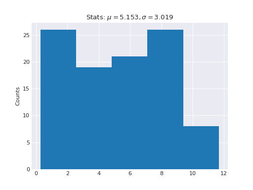
The Marvin hist function makes creating 1-d histograms an easy one-liner.
# create some random data x and, say, an associated property y
import numpy as np
x = np.random.random(100) * 10
y = np.random.random(100) * 10

# create and plot a 1-d histogram from scratch with bin size of 50
from marvin.utils.plot.scatter import hist
output = hist(x)
(Source code, png, hires.png, pdf)
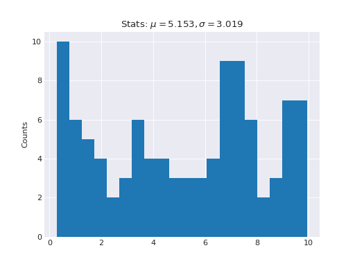
The default binsize is set to use scott binning scheme. Make a new histogram with a binsize of 20.
# create and plot a 1-d histogram from scratch
from marvin.utils.plot.scatter import hist
output = hist(x, bins=20)
(Source code, png, hires.png, pdf)

Using Histogram Plot
The Marvin hist function also accepts all keyword arguments the standard Matplotlib hist does.
Handling the Histogram Data
Marvin hist outputs a dictionary of information related to how the input data was binned. Marvin hist outputs the following information:
bins - The number of bins used
counts - The counts of the number of objects in each bin
binedges - The left edge of each bin
binids - A list of the same shape as the input data containing the binid for each data element
indices - A dictionary containing, for each binid, a list of the data array indices in that bin.
# histogram the above x data into 20 bins
histdata, fig, ax = hist(x, bins=20)

# list the keys
histdata.keys()
['indices', 'binids', 'counts', 'binedges', 'bins']

# see the counts in each bin
histdata['counts']
array([ 6., 5., 2., 4., 5., 3., 4., 3., 4., 10., 4.,
       12., 1., 8., 6., 5., 6., 7., 1., 4.])

# print the array elements belonging to the first bin (of 6 elements)
histdata['indices'][1]
[3, 15, 34, 76, 79, 92]
To retrieve the original data elements within each bin, use the marvin.utils.general.map_bins_to_column() utility function.
# get the dictionary of original array indices in each bin
inds = histdata['indices']

# map the input x array into each bin
xmap = map_bins_to_column(x, histdata['indices'])

# print the x values belonging to the first bin
xmap[1]
[0.1575060258473926, 0.08802601587924563, 0.4161007162179975, 0.01857576984299336, 0.36516366661006106, 0.1930399242480796]

# print the associated property y for the data in the first bin
ymap = map_bins_to_column(y, histdata['indices'])
ymap[1]
[1.752277519893024, 0.14971243980928972, 3.5618190994549193, 9.636290148502516, 4.988823838768434, 4.608193194229566]
Labeling with the Marvin Datamodel
Besides accepting standard strings for your x- and y- labels, the xlabel and ylabel keywords accept Marvin DataModel columns, either a QueryParameter, or a Property. These can be used for publication quality display for your labels.
# use a standard custom string label
out = hist(x, xlabel='this is my x-axis')

# use a Marvin DataModel object from MPL-5
from marvin.utils.datamodel.dap import datamodel
dm = datamodel['MPL-5']

# grab the Ha emission line flux property
prop = dm['emline_gflux_ha']
<Property 'emline_gflux', release='2.0.2', channel='ha_6564', unit=u'erg / (cm2 s spaxel)'>

# make the histogram using the Marvin Property
out = hist(x, xlabel=prop)
Manipulating the Axes
You can manipulate the axis object after it is returned.
hist_data, fig, axis = hist(x)
axis.set_title('this is my new title')
axis.set_ylabel('Bins')
axis.set_xlim(0, 2)
Inputing a Separate Figure/Axis
To insert your histogram into an existing Matplotlib figure and axis obejct you have created, just pass them as keyword arguments.
# let's create an example "previous" 2x2 figure/axis object using GridSpec
import matplotlib.pyplot as plt
from matplotlib.gridspec import GridSpec
my_figure = plt.figure()
gs = GridSpec(2, 2)
my_axis = my_figure.add_subplot(gs[0, 1])

# insert our histogram into the existing figure
output = hist(x, fig=my_figure, ax=my_axis)
Reference/API
Module
Functions
|
Create a histogram of an array |
Compute some statistics given a data array |