Scatter (marvin.utils.plot.scatter)
Introduction
marvin.utils.plot.scatter contains utility functions for creating scatter plots in Marvin. The main function in this module is plot(), which is thinly wrapped by the plot() method in the Results class for convenience.
Getting Started
The Marvin plot function makes creating quick 2d scatter plots an easy process.
# create some random data x and y
import numpy as np
x = np.random.random(100)*10
y = np.random.random(100)*10

# create and plot a 2-d scatter plot from scratch
from marvin.utils.scatter import plot
output = plot(x, y)
Using Scatter Plot
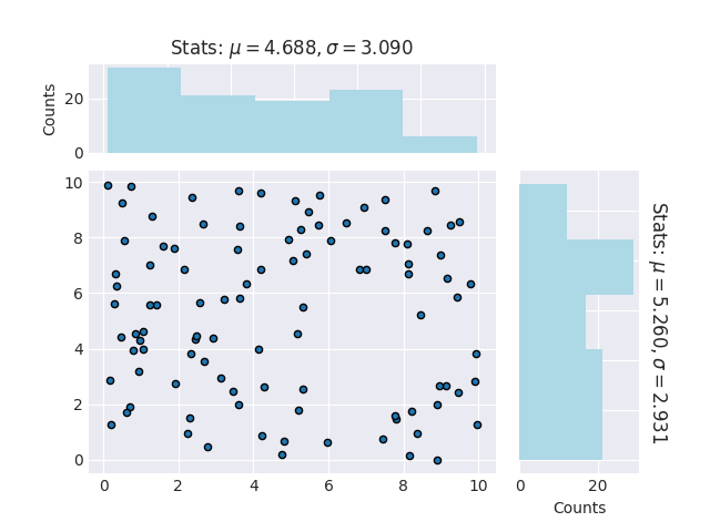
The Marvin scatter plot function uses three Matplotlib plotting routines under the hood to display. For data arrays containing less than 1000 points, Marvin uses the Matplotlib scatter function to display a traditional 2d scatter plot. For data arrays containing between 1000 and 500000 points, Marvin uses the Matplotlib hexbin function to display a 2d hex-binned density distribution plot. For data arrays of more than 500000 points, Marvin creates a density distribution scatter plot, using the Matplotlib scatter-density code. The Marvin plot function accepts as input all keyword arguments for the Matplotib scatter, hexbin, hist functions.
Inputs
The scatter.plot function accepts as input a few different types of data. It accepts Python lists or numpy arrays as x and y input.
You can optionally provide a Pandas dataframe using the data keyword argument. When doing so, x and y are string names specifying columns in your Pandas dataframe.
# make a dataframe with some custom columns
import pandas as pd
df = pd.DataFrame({'x':x, 'y':y, 'x2':x**2})

# use the Dataframe as input into scatter.plot
output = plot('x2', 'y', data=df)
With Histogram
By default, scatter.plot will create x and y histogram distributions, and include them in the figure. You can turn this feature off with the with_hist keyword argument.
# only display the scatter plot
output = plot(x, y, with_hist=False)

# only display the x-histogram
output = plot(x, y, with_hist='x')

# only display the y-histogram
output = plot(x, y, with_hist='y')
Labeling with the Marvin Datamodel
Besides accepting standard strings for your x- and y- labels, the xlabel and ylabel keywords accept Marvin DataModel columns, either a QueryParameter, or a Property. These can be used for publication quality display for your labels.
# use a standard custom string label
out = plot(x, y, xlabel='this is my x-axis')

# use a Marvin DataModel object from MPL-5
from marvin.utils.datamodel.dap import datamodel
dm = datamodel['MPL-5']

# grab the Ha emission line flux property
prop = dm['emline_gflux_ha']
<Property 'emline_gflux', release='2.0.2', channel='ha_6564', unit=u'erg / (cm2 s spaxel)'>

# make the histogram using the Marvin Property
out = plot(x, y, xlabel=prop)
Output
The Marvin plot always outputs the figure and axes objects from Matplotlib. It will also optionally output any histogram data if you are including the histograms in your figure. See Using Histogram Plot for details on the histogram output.
Reference/API
Module
marvin.utils.plot.scatter |
Functions
marvin.utils.plot.scatter.plot(x, y, **kwargs) |
Create a scatter plot given two columns of data |